Opportunity
Kenlo's Digital Pipeline was built to support a specific financial product: Kenlo Garante, a rental guarantee solution. The original flow (proposal, guarantee, formalization) was intentional: the broker created the proposal, linked Kenlo's guarantee, and forwarded it to Kenlo Locação, the proprietary ERP platform that monetizes per administered contract.
The landscape shifted when solutions focused exclusively on pre-service began gaining traction with agencies, covering lead capture, visit management, and client follow-up before the proposal stage. Kenlo had none of that, and agencies were paying for these services separately.
The strategic decision was to expand the pipeline to cover the entire funnel, bringing pre-service into the platform. The logic was straightforward: with the complete flow inside Kenlo, there would be higher retention, more data, and room to monetize through new features, which is exactly what happened.
But there was a critical barrier: only 3% of the user base was using the pipeline as their primary platform. Without solving that, the product expansion would have no traction.
Discovery
The project came to me as a small visual redesign task. As I explored the product, I realized the problems I was seeing had no visual solution. Brokers would open the screen and simply couldn't work: a client interested in five properties turned into five disconnected kanban cards. No history. No context. Proposing aesthetic improvements on top of that would have been wasted work. I needed to understand the depth of the problem before proposing any direction.
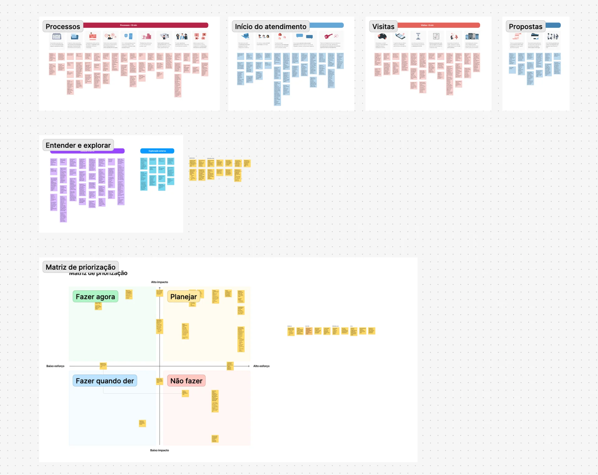
I started by conducting 20 interviews with brokers and real estate managers from agencies of different sizes and regions. The team's researcher helped with scheduling, method definition, note-taking during sessions, and data analysis, but I was responsible for leading the interviews, running user tests, and synthesizing insights to present to the product team and guide the project's direction.
I also watched more than 50 recorded sessions looking for friction patterns, and analyzed the support ticket history: 40% of complaints were about being unable to retrieve a client's history. I organized workshops with PMs, tech leads, and the other designer to align findings and prioritize the solution scope.
What I found
Three core problems were confirmed, all pointing to the same root:
- Lost context: brokers didn't know if they'd served that client before, which properties they'd seen, or what the last interaction was
- Unmanageable kanban: high-volume agencies had hundreds of duplicate cards, impossible to work with
- Blocked architecture: features that had been on the roadmap for years were technically impossible with the existing data structure
That was the turning point. I presented the diagnosis to the team: the project no longer fit within an interface improvement. The architecture needed to be refactored from scratch.
Results
Design decisions
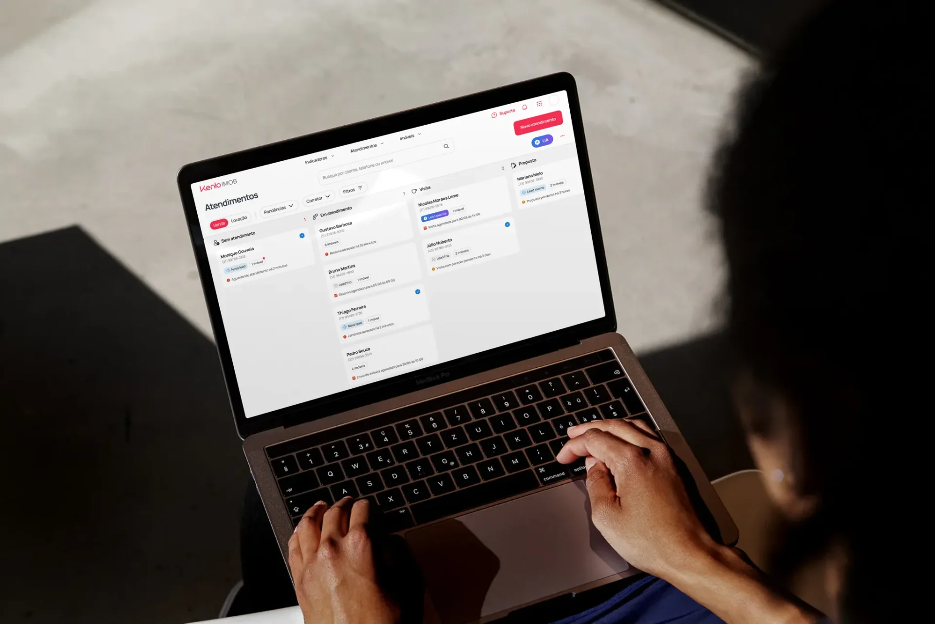
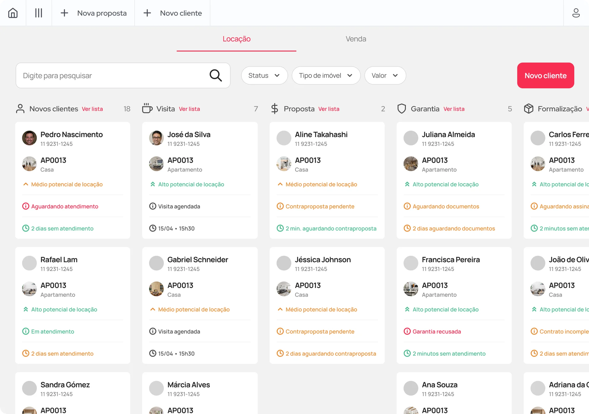
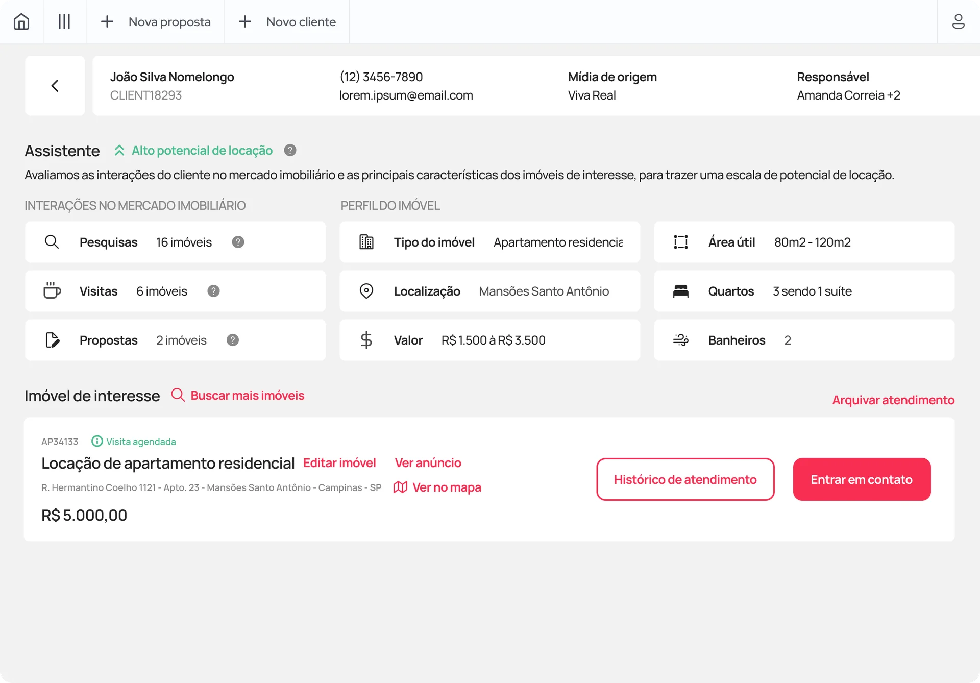
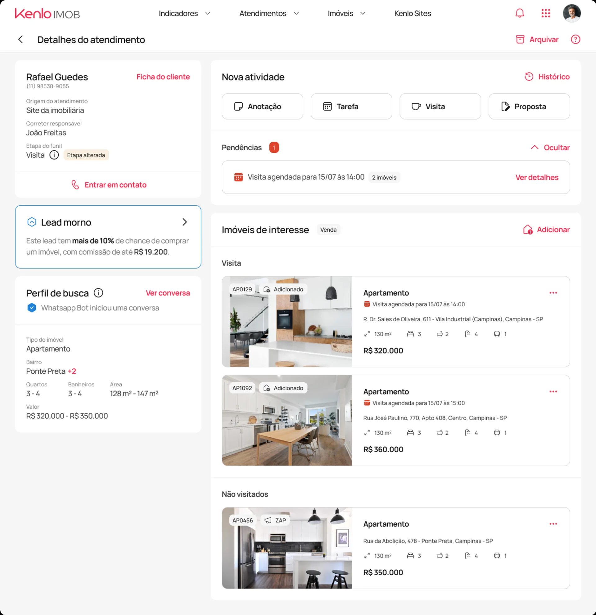
The central change was reorganizing the system around the client, not the property. A client now had a single card, with all interactions, visits, and proposals linked to them. History preserved, context always accessible.
Unified global header: the symbolic divider between the old version and "New Imob," with integrated navigation across all modules.
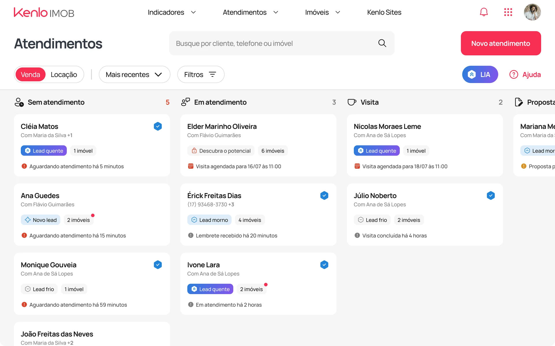
Rethought detail screen: client summary on the left for quick context, main content on the right segmented into blocks, with visual prominence for pending items.
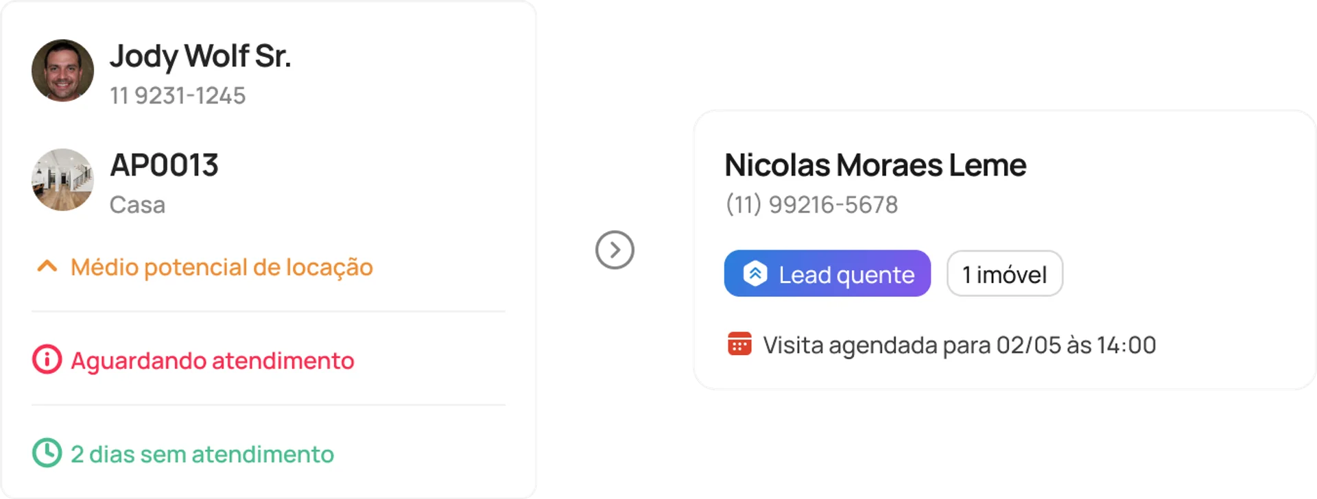
Simplified cards: removal of excessive information, standardized status labels, and a focus on quick scannability.
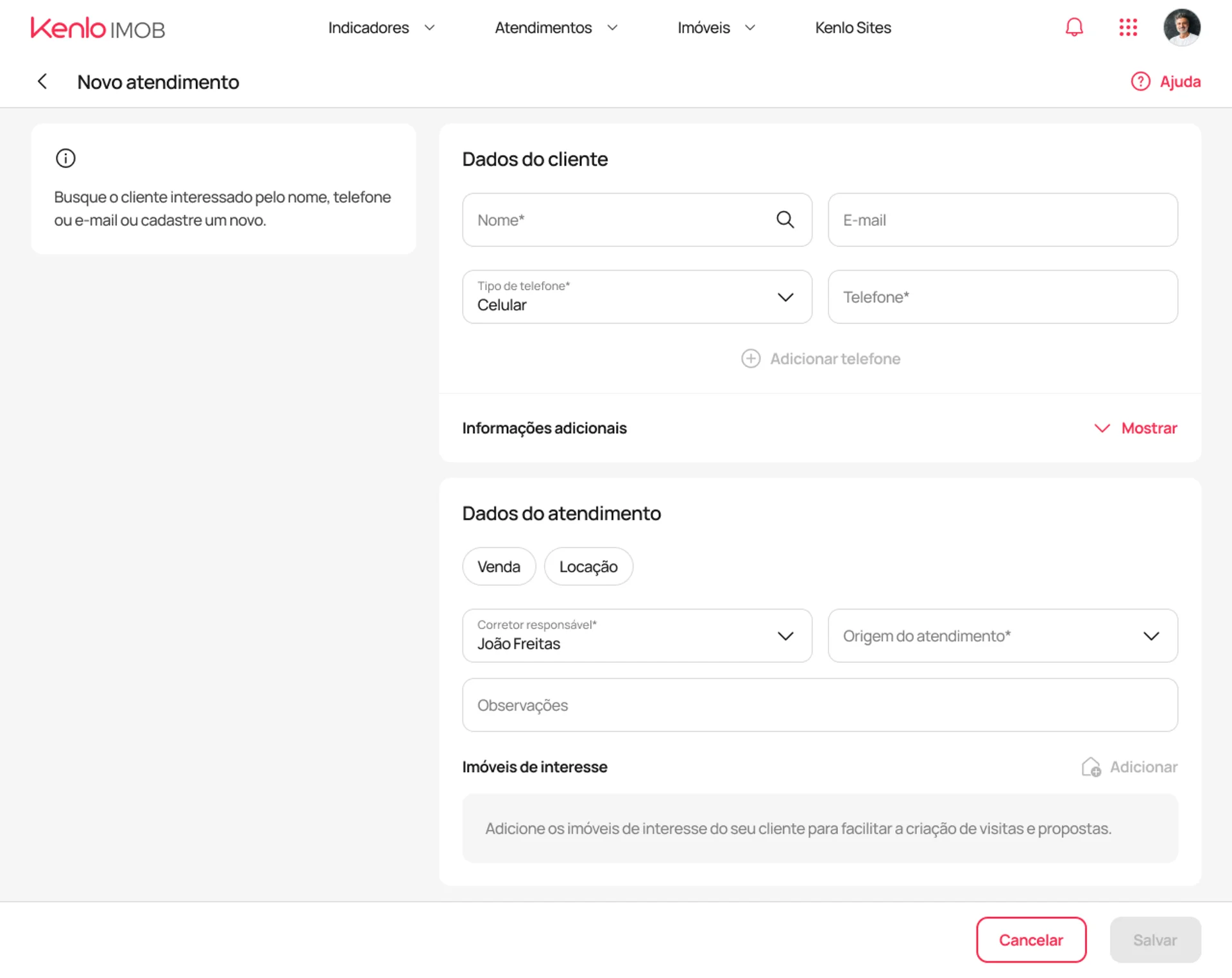
Redesigned new service flow: the CTA changed from "New client" to "New service," reflecting the system's conceptual shift.
Handoff and technical collaboration
For a project with multiple flows and dozens of scenarios, I structured documentation with detailed behavior specifications and a numbered index for easy navigation, an evolution from the company's standard at the time. I worked closely with three engineers navigating Vue and React constraints, making tradeoff decisions between the ideal and the technically feasible.
Deploy
Migration was handled as a product decision: we didn't force the transition. We created a transition screen that allowed each agency to migrate at their own pace, with support and training throughout the process. 90% of the agencies that migrated did so by their own choice.
Metrics
Active users
214 → 20,000
Over an 18-month period
Adoption rate
3% → 32%
Of total user base
NPS
2.6 → 4.0
Recurring monthly rating
The new architecture also unlocked the roadmap: features that were technically unfeasible became developable, and system stability increased significantly.
Learnings
Comprehensive research defines the real project scope
That was the central lesson. The project came in as a cosmetic redesign, and if I had simply executed it, I would have delivered a prettier interface on top of a broken architecture. It was the research with brokers, managers, CS, and support that revealed the real problem and gave me concrete arguments to defend a much larger scope. Each group saw a different dimension of the system; only with all perspectives together was it possible to see the whole.
Information architecture precedes interface design
The decision to reorganize the system around the client, rather than the property, wasn't visual. It was conceptual. When the problem is structural, changing the appearance doesn't fix it. That distinction now guides how I evaluate and propose projects.
Gradual migration is a product strategy
Giving agencies control over their transition pace was what ensured that 90% migrated by their own choice. Forced transitions create resistance; autonomy creates adoption.